Pick Your Palaette
Many homeowners view their walls as a blank canvas that can be used to express themselves. Studies have been performed about the use of wall colors and their effects on one’s outlook. Because of this, some colors make sense in certain areas and not in others. When determining what color a room should be painted, it’s important to consider the size of the space, the purpose of the room and the colors surrounding that room. We’ve got the scoop what colors work best in different types of rooms and what message the colors send.
Gray: Gray exudes a modern & cozy feeling. It appears to be elegant without being stuffy. Gray is a versatile color that works well in living rooms and bedrooms and pairs well with bright colors as well as white accents.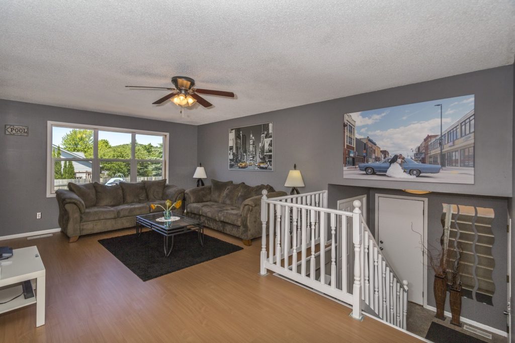
Red: Ever notice how many restaurant chains incorporate the color red into their logo? The color red in restaurant logos and décor is no accident. The color red subconsciously stimulates your appetite and offers the illusion that food tastes better. Beware, because red can also raise your blood pressure and cause irritability. If you’re set on incorporating red onto your walls, opt for a lighter shade of red which has fewer negative psychological effects than bold red.
Yellow: Yellow is perceived as bright and cheery because it is the same color as the sun which stimulates feelings of happiness & energy. However, the wrong shades of yellow can have negative effects on someone because yellow is the strongest color. Did you know that babies in yellow nurseries are more likely to cry than those with any other color? This is because the color can cause feelings of anxiety & frustration. Limit the amount of yellow in your home and keep it to pale shades. It works best in entries and hallways because of the minimal time that is spent in these areas.
Green: The color green reminds us of nature which has a calming effect and lowers stress levels. Neutral greens are great for bedrooms and bathrooms where a tranquil setting is desirable. Brighter shades can add some personality to a room & in small doses (think a walk-in closet or dressing room) can add excitement. Green is an ideal color for home or corporate offices, as studies have shown that employees that work in green offices experience fewer stomachaches than those without.
Purple: When purple occurs in nature, it is often in delicate flowers such as lilacs or violets. Therefore, the color has a more feminine feel. The color is also associated with creative thinking. Light purple tones work well in girl’s bedrooms and darker purple can be used in other smaller spaces around the home. Using the color purple shows your imaginative side because it is one of the less common colors in the home.
Brown: Brown is a great color for living rooms because it’s a safe & nurturing color. It allows people to feel at ease and encourages conversation. Too much brown can make a room feel drab so it’s best to incorporate brighter accent colors to make an attractive space. Colors that go well with brown are: blue, orange, yellow & pink.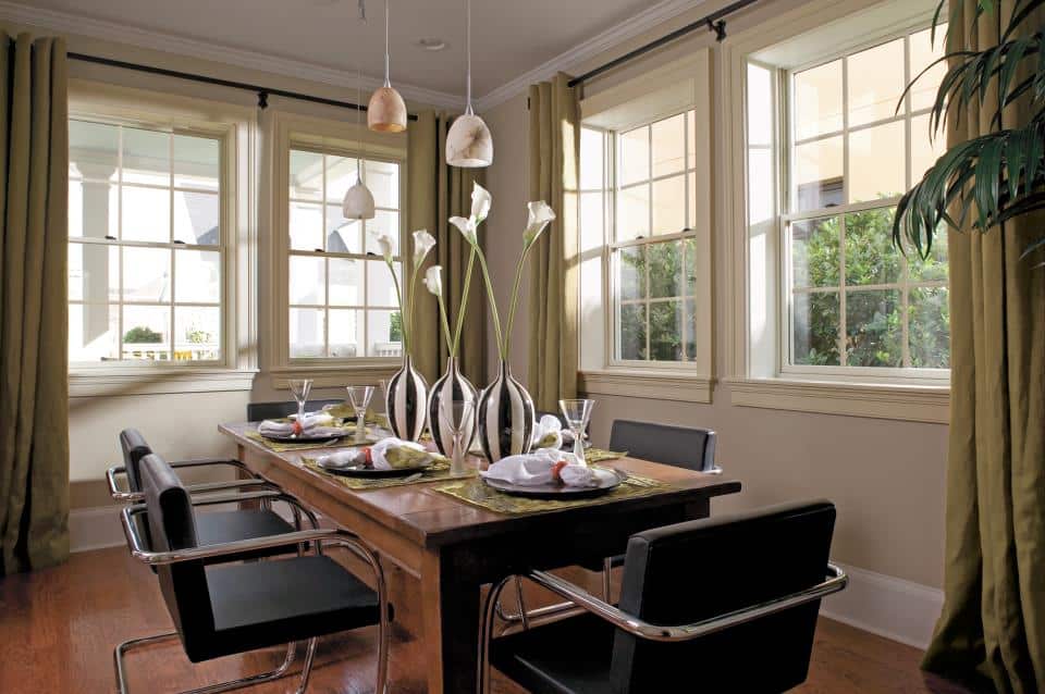
Orange: The color orange is a combination between red and yellow. It promotes warmth and energy. The color is often considered inviting and can be a good alternative to red & yellow which can be hard on your eyes. Warm shades of orange can stimulate the appetite and can be a welcome color in a dining room.
Pink: Like purple, pink is considered a feminine color. Light shades of pink have a calming effect and darker shades create enthusiasm and excitement. Beware of too much pink which can be overpowering and distracting.
White: White is basic, but is by no means boring! When used correctly, white paint can create a blank canvas to allow your accessories & furniture to pop. White also gives room a clean look and makes small spaces appear larger. White is versatile and can be used in any room in your home.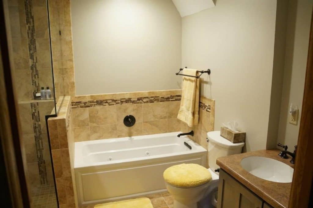
Black: Black can work great on an accent wall in a bedroom or living room. It can also work well in a library where one or more walls are covered with book shelves. It also works well in a room where mounted photographs are a focal point. Make sure that your commitment to black is firm, as painting over it will likely take several coats.
Blue: Did you know that more people choose blue as their favorite color? This is likely because blue’s effects are the exact opposite of red. Because most shades of blue are perceived to have a calming effect, it can be the ideal shade for a bathroom or bedroom. Turquoise shades of blue can stimulate creativity and can be the idea shade for a home office.